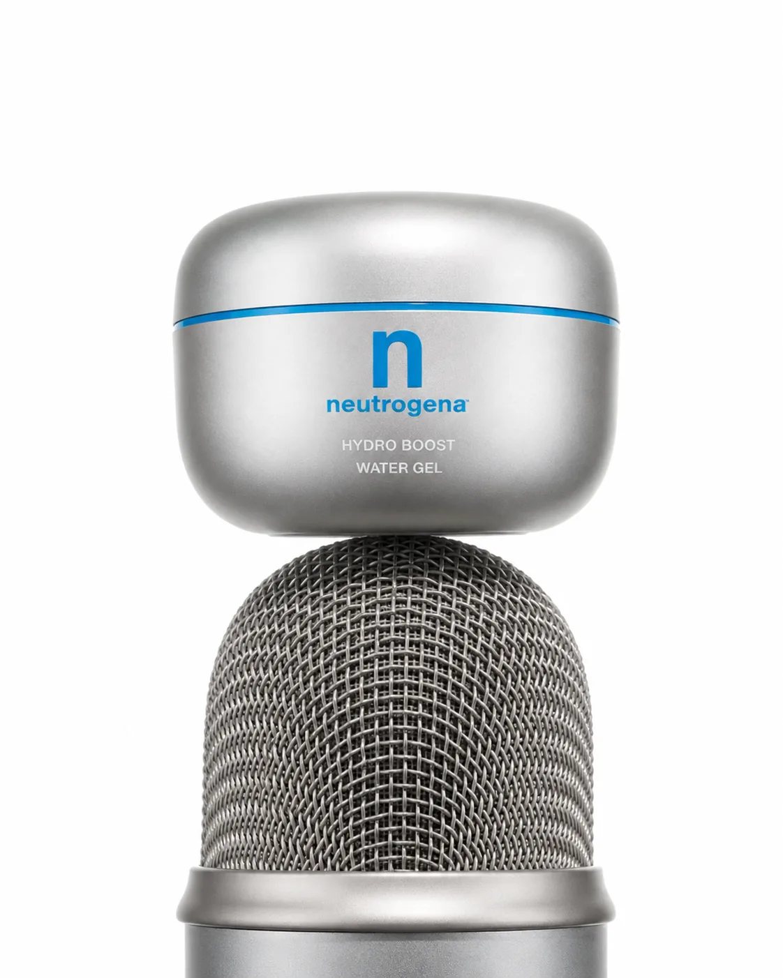
Neutrogena, reimagined.
Good products, wrong language. Neutrogena has world-class formulas, real dermatologist credibility and decades of trust — but its visual identity speaks to a consumer who shops by necessity, not desire.
This is a speculative rebrand: same brand, same science, a completely different feeling.
Not affiliated with Neutrogena®. Independent concept by Isabella Taira.
The Problem
Good products, wrong language.
Drugstore packaging in a cool-brand era.
Neutrogena has world-class formulas, real dermatologist credibility and decades of trust. But their visual identity speaks to a consumer who shops by necessity — not desire. And Gen Z only buys desire.
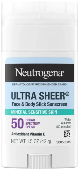
Science-backed becomes a lifestyle.
The science is real. The trust is earned.
The only missing piece is a visual identity that makes people want to display the product — not hide it under the sink.
One packaging update changes everything downstream.
Same product, different world.
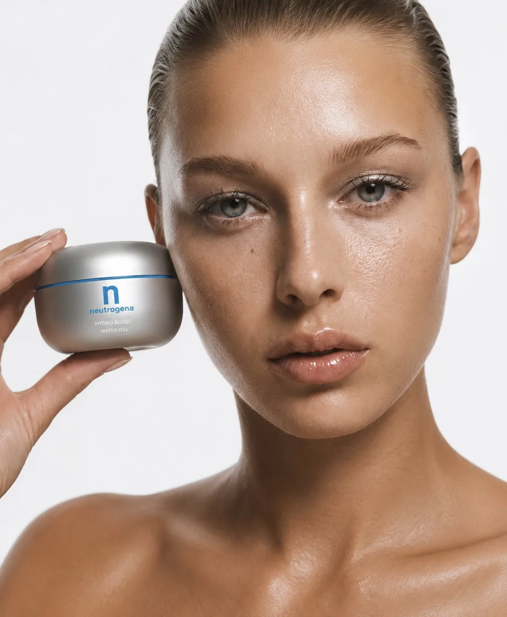
Same science. Same promise. New desire. "Beauty to a Science" — reimagined, not replaced.
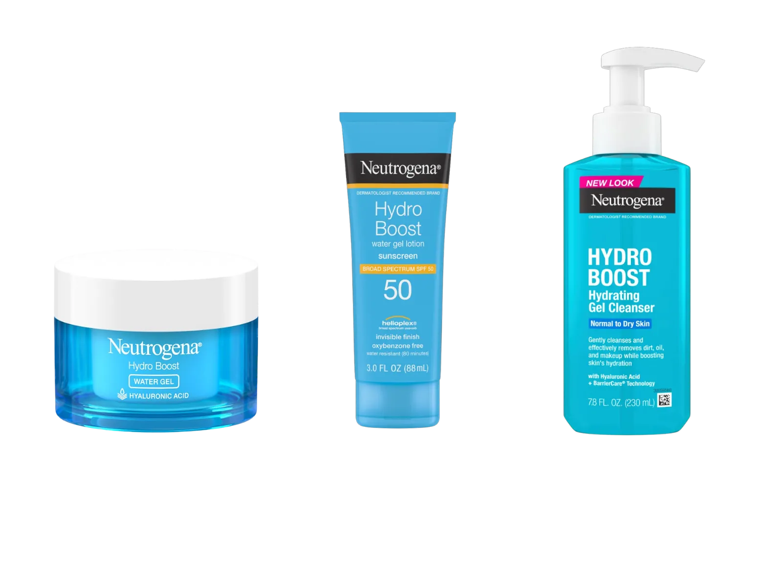
Generic, clinical, invisible.
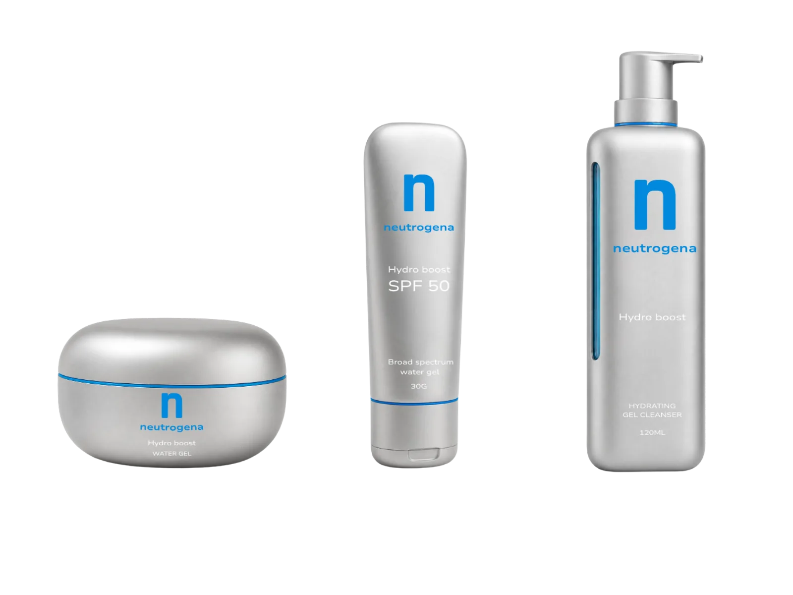
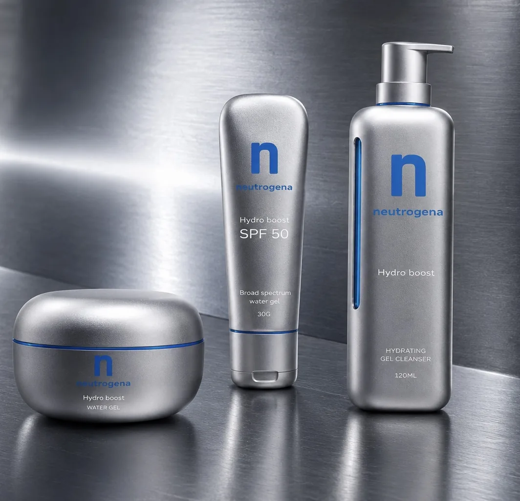
Futuristic, premium, unmissable.
Packaging Concept
Three hero products. One visual language. Instantly recognizable. Impossible to ignore.
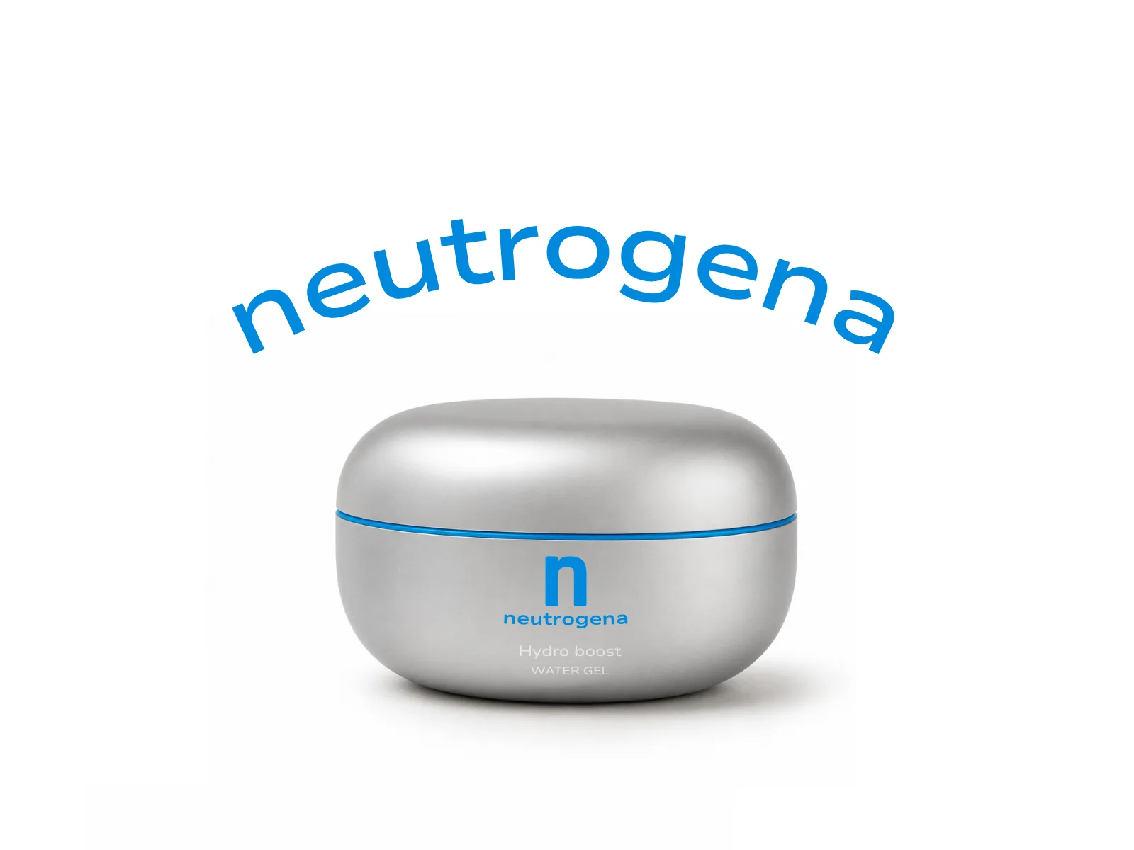
The Travel Size Kit — Reimagined
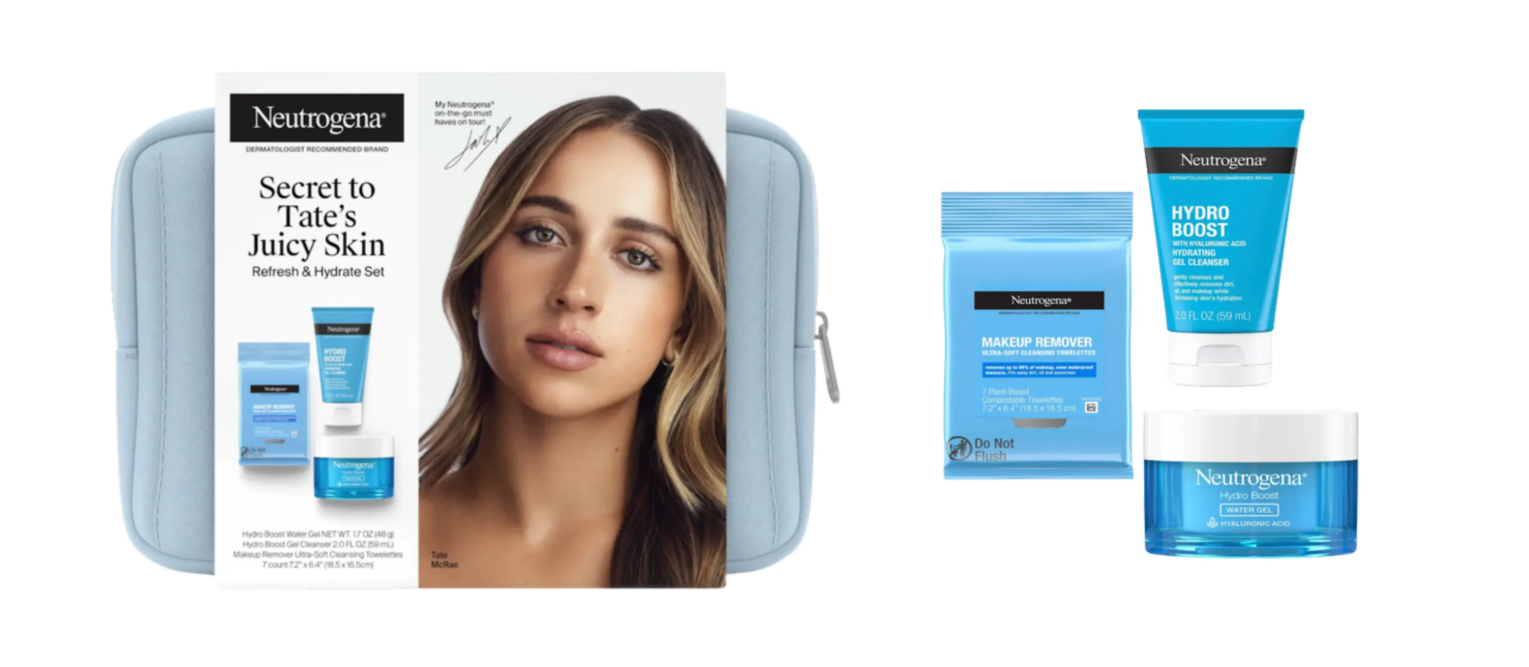
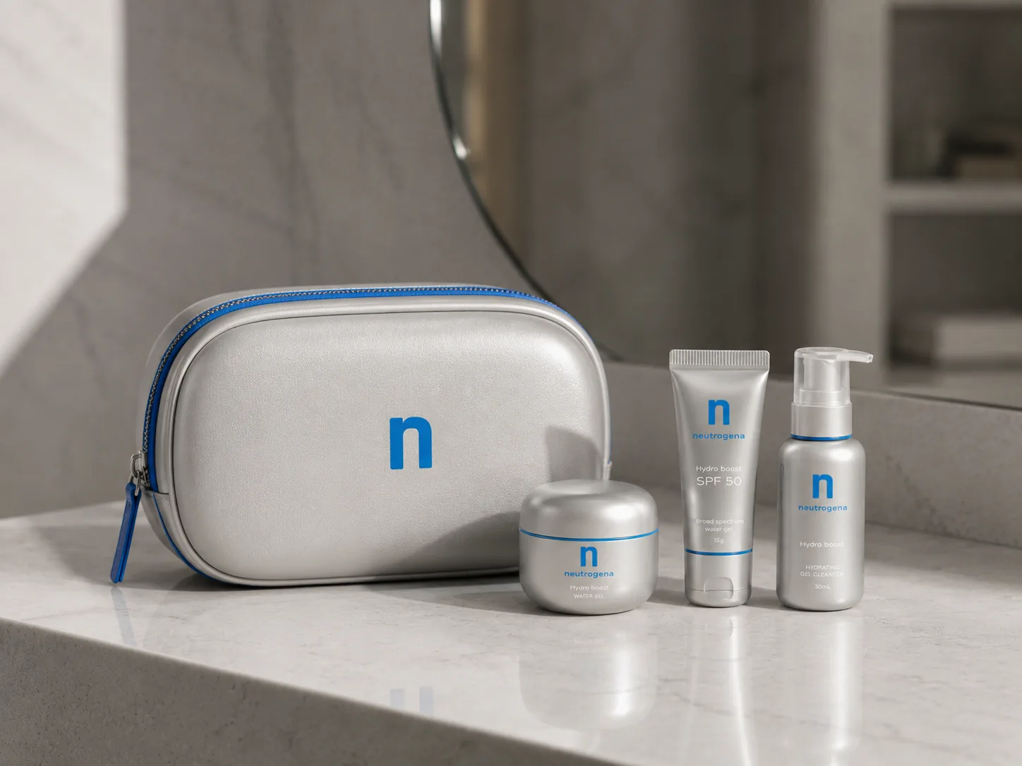
When the Product Doesn't Match the Face
The kit's face is an it-girl aesthetic — but the original packaging wasn't. Fans noticed: the products didn't match her world. This rebrand changes that. Sleek, silver, editorial. Now the product belongs in her world.
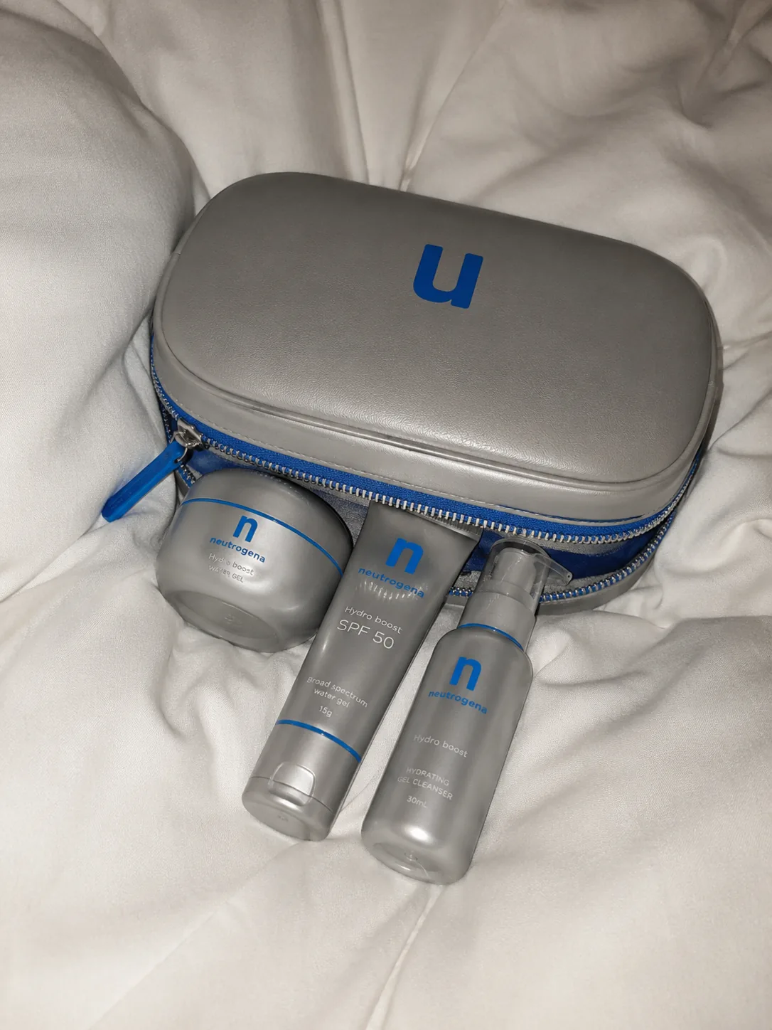
The Instagram Strategy
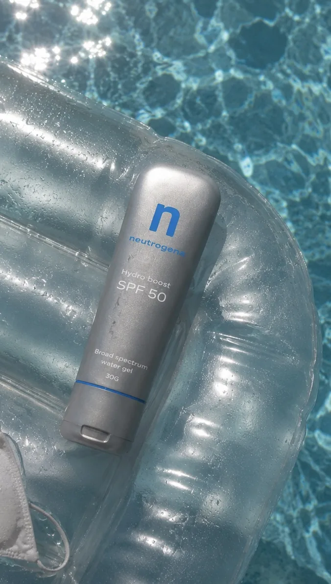
- Sensorial
- texture, water, skin close-ups
- Science
- ingredients as lifestyle vocabulary
- Aspirational
- the woman, not the product
- Community
- real skin, real results
When the feed looks this good, every post is a reason to follow. And to buy.
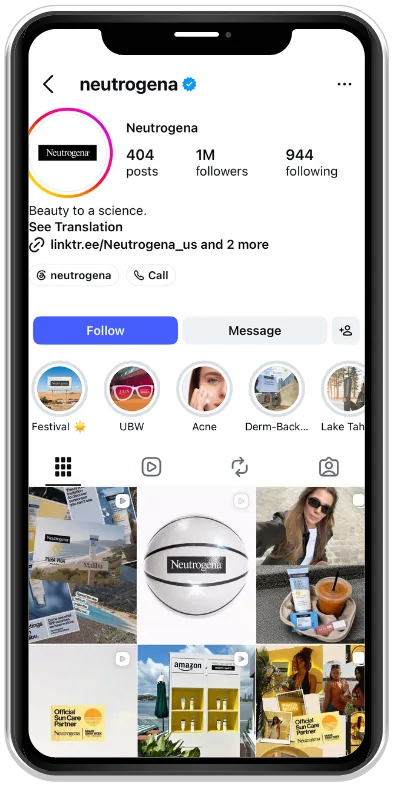
Before
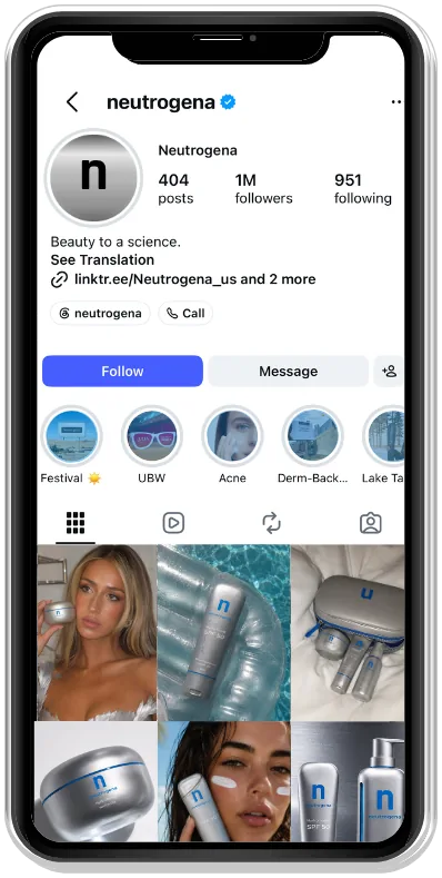
After
The Campaign Vision
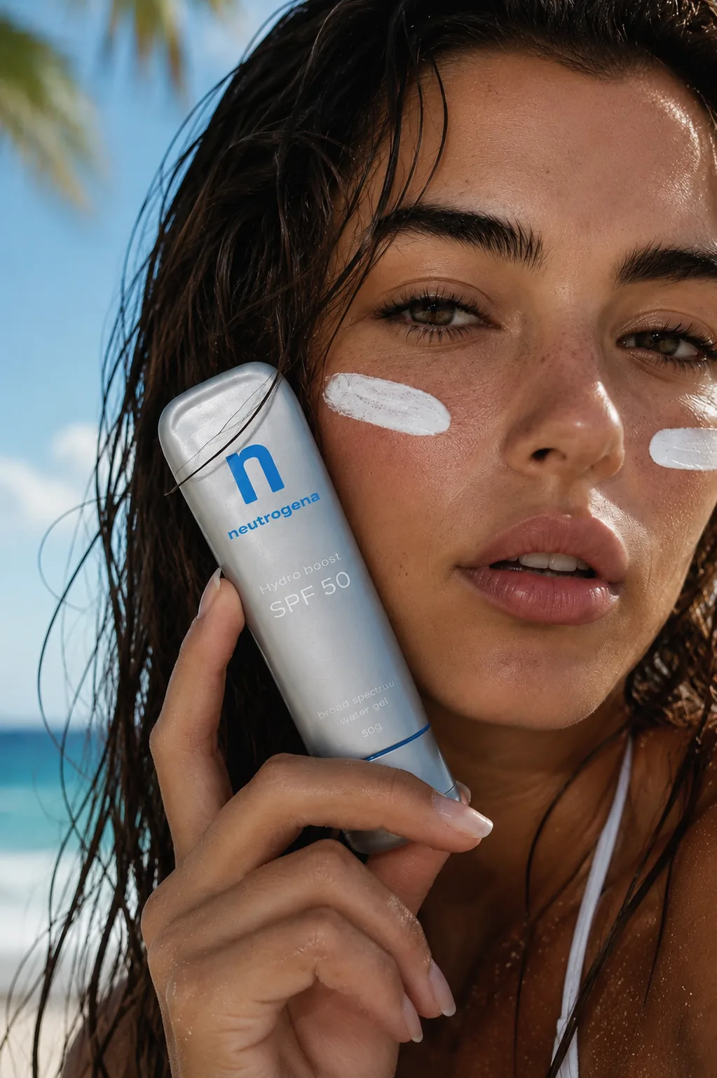
Science that looks like desire. When the product looks this good, marketing becomes effortless.
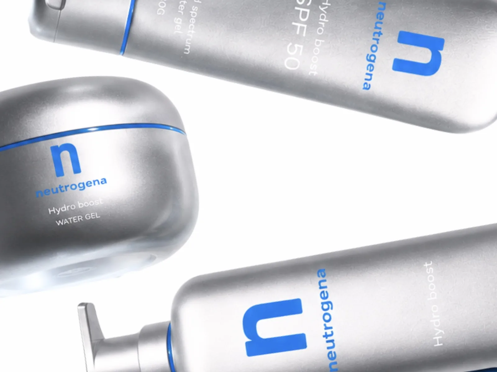
The products were always good. The design just needed to catch up.